Reimagining an Anime Collectibles Storefront for the Modern Collector
We completely redesigned AnimePrinted's Shopify storefront — building a dark, immersive shopping experience with franchise collections, trending sections, and mobile-first product grids that drove 187% revenue growth and reduced cart abandonment by 41% within the first 90 days.
The website we built.
Real screenshots from the live site. Every detail designed with purpose, every interaction crafted for conversion.

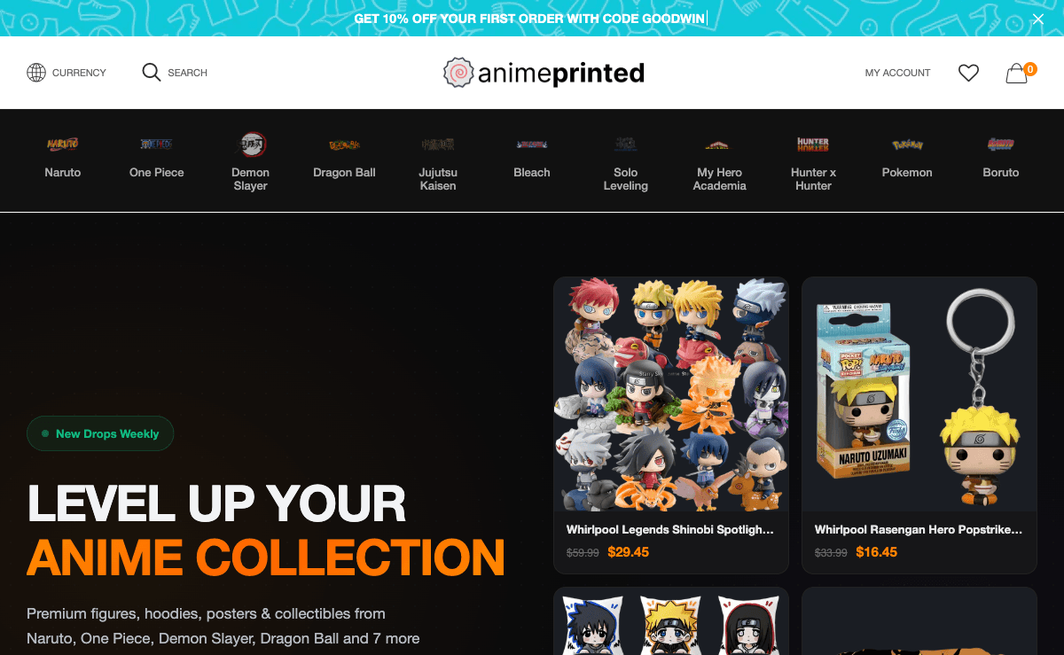
Bold hero with product showcase, franchise navigation, and featured products
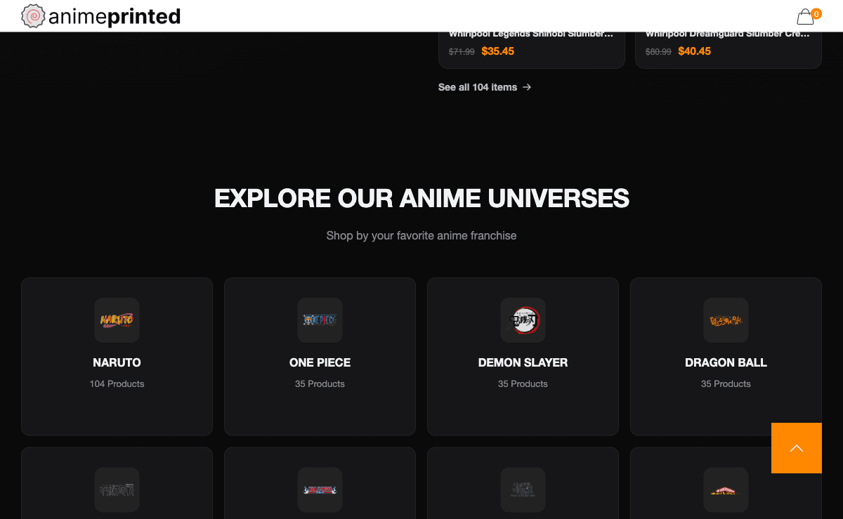
Franchise collection grid with product counts and dark card design
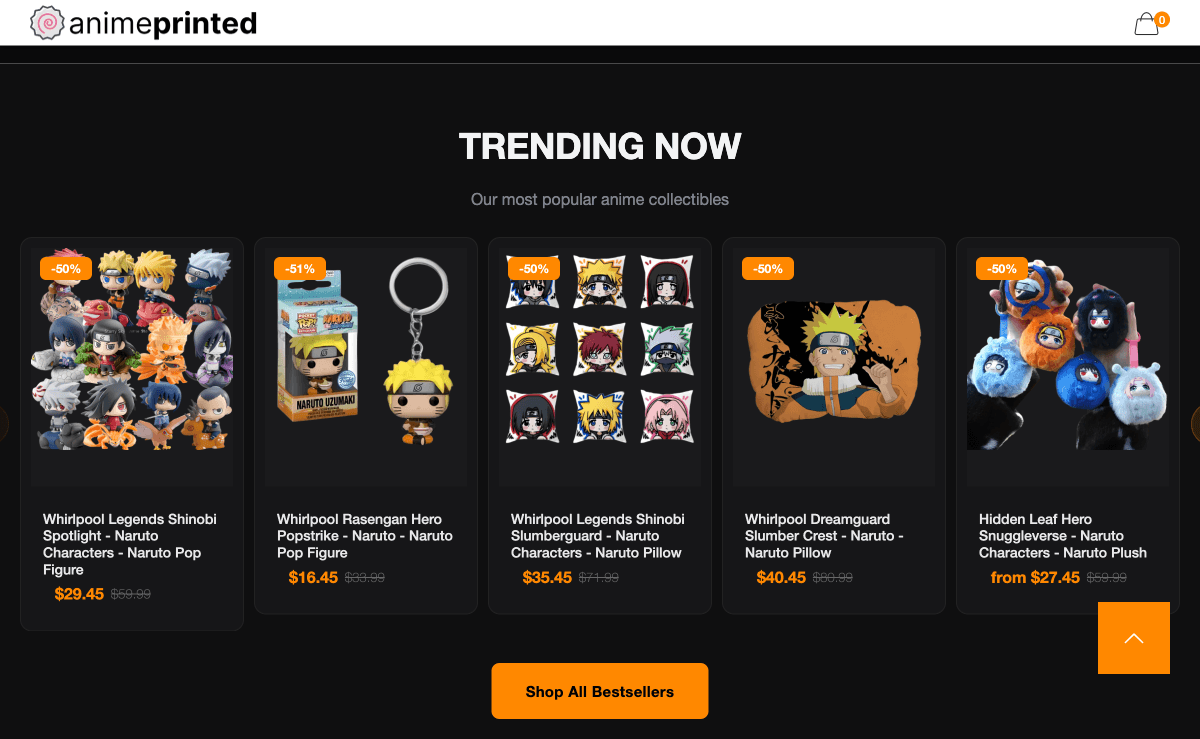
Trending products with sale badges, discount pricing, and shop all CTA
Where AnimePrinted started.
AnimePrinted had carved out a loyal niche selling anime-themed apparel, posters, and collectibles. Their Instagram following of 45,000 fans drove consistent traffic, but the Shopify store was hemorrhaging potential revenue at every stage of the funnel. The storefront was built on a free Shopify theme with minimal customization — product images were inconsistently sized, the navigation was a flat alphabetical list of 200+ products, and the mobile experience was essentially an afterthought despite 74% of their traffic coming from phones.
The numbers told a painful story. Cart abandonment was at 78%, well above the industry average of 69% for e-commerce. Average order value sat at $32, held down by the lack of cross-selling, bundling, or any mechanism to encourage multi-item purchases. The mobile conversion rate was a dismal 0.9%, meaning over 99% of mobile visitors left without buying. Product pages loaded in over 5 seconds on mobile, and the checkout flow required 6 separate steps — an eternity for impulse-driven anime merchandise purchases.
Perhaps the biggest missed opportunity was in product discovery. AnimePrinted carried items across dozens of anime franchises — Demon Slayer, Jujutsu Kaisen, One Piece, Attack on Titan — but there was no way to browse by franchise, by trending series, or by product type within a franchise. Fans who came looking for Jujutsu Kaisen merchandise had to scroll through pages of unrelated items to find what they wanted. The store was sitting on a goldmine of passionate fans and high-intent traffic, but the shopping experience was actively working against conversion.
The strategy behind the numbers.
Franchise-First Information Architecture
We completely restructured the store's navigation around franchise collections — the way anime fans actually think and shop. Each franchise got its own curated landing page with hero artwork, featured products, and sub-categories (apparel, posters, accessories). We also created dynamic 'Trending Now' and 'New Arrivals' sections powered by Shopify metafields that the AnimePrinted team could update weekly to align with new anime releases and seasonal trends.
Dark-Theme Storefront Redesign
We designed a fully custom Shopify theme with a rich dark background that made the vibrant anime artwork pop. Product cards featured consistent image ratios with subtle hover animations, orange accent colors guided the eye toward CTAs, and a grid-based layout created a gallery-like browsing experience. The overall aesthetic felt like walking into a premium anime shop — immersive, curated, and designed for discovery.
Mobile-First Product Experience
Since 74% of traffic was mobile, we designed mobile-first and adapted upward. Product images were optimized for vertical scrolling with swipe-enabled galleries. The add-to-cart button remained sticky at the bottom of the viewport. We implemented a one-tap size selector, reduced the checkout to 3 steps using Shopify's checkout extensibility, and added Apple Pay and Google Pay for single-tap purchasing.
AOV Optimization & Cart Recovery
We implemented a suite of average order value boosters: 'Complete the Look' cross-sell modules on product pages, franchise-themed bundles at a 15% discount, a free shipping progress bar in the cart, and a 'Fans Also Bought' recommendation carousel. For cart recovery, we designed a three-email abandonment sequence with franchise-specific imagery and a time-limited 10% discount on the third email.
Want a strategy like this for your business?
We'll audit your current SEO, identify your biggest opportunities, and outline a roadmap to get there. No obligation, no sales pitch.
The numbers speak for themselves.
Organic clicks growth
Monthly performance over the engagement period
Built a fully custom Shopify theme with 18 franchise collection pages and dynamic trending sections
Reduced mobile checkout from 6 steps to 3 with Apple Pay and Google Pay integration
Implemented cross-sell and bundle features that increased average order value by 69%
Optimized all product images with automated resizing pipeline, cutting average image size by 72%
Designed a cart abandonment email sequence that recovered 14% of abandoned carts in the first month
Created a franchise-first navigation system that increased pages-per-session by 82% on mobile
Global reach, local precision.
While you're reading this, your competitors are ranking.
Every month without SEO is revenue left on the table.
Takes 2 minutes. No credit card required.
Month by month progression.
Audit, Strategy & Design
Conducted a full UX audit of the existing store, analyzed heatmaps and session recordings, and mapped the new franchise-first information architecture. Designed the complete dark-theme storefront in Figma across all key page templates and responsive breakpoints.
Custom Theme Development
Built the custom Shopify theme using Liquid, Tailwind CSS, and Alpine.js. Developed all collection page templates, product page layouts, and dynamic sections. Implemented the franchise landing page system with metafield-driven content.
Mobile Optimization & Checkout
Focused entirely on mobile experience: sticky add-to-cart, swipe galleries, one-tap size selectors, and the streamlined 3-step checkout. Integrated Apple Pay and Google Pay. Ran performance optimization to achieve sub-2-second load times on 4G connections.
AOV Features & Cart Recovery
Built and configured cross-sell modules, franchise bundles, free shipping progress bar, and recommendation carousels. Designed and set up the 3-email cart abandonment sequence with dynamic franchise-specific content blocks.
Launch, QA & Optimization
Migrated all products to the new theme with zero downtime, ran comprehensive QA across 15 device/browser combinations, set up enhanced e-commerce analytics, and began A/B testing product page layouts. Revenue jumped 68% in the first 30 days post-launch.
“I always knew our store wasn't doing our products justice, but I didn't realize just how much revenue we were leaving on the table. Above Blank turned our Shopify store into something that actually feels like a destination for anime fans. The franchise collections, the dark theme, the speed on mobile — everything is dialed in. Our customers literally DM us on Instagram saying the store looks amazing now. And the numbers speak for themselves: revenue almost tripled.”
More case studies
Ready for results
like these?
Every engagement starts with a free SEO audit. We'll identify your biggest growth opportunities and build a strategy to capture them.