Designing the Digital Face of AI-Powered Social Connection
We designed and built the entire web presence for IceBreak AI — a dark, immersive experience with cyan and magenta gradients, glassmorphism UI, and app showcase sections that drove a 4.2x increase in conversion rate and positioned the brand as a leader in AI-powered social apps.

The website we built.
Real screenshots from the live site. Every detail designed with purpose, every interaction crafted for conversion.
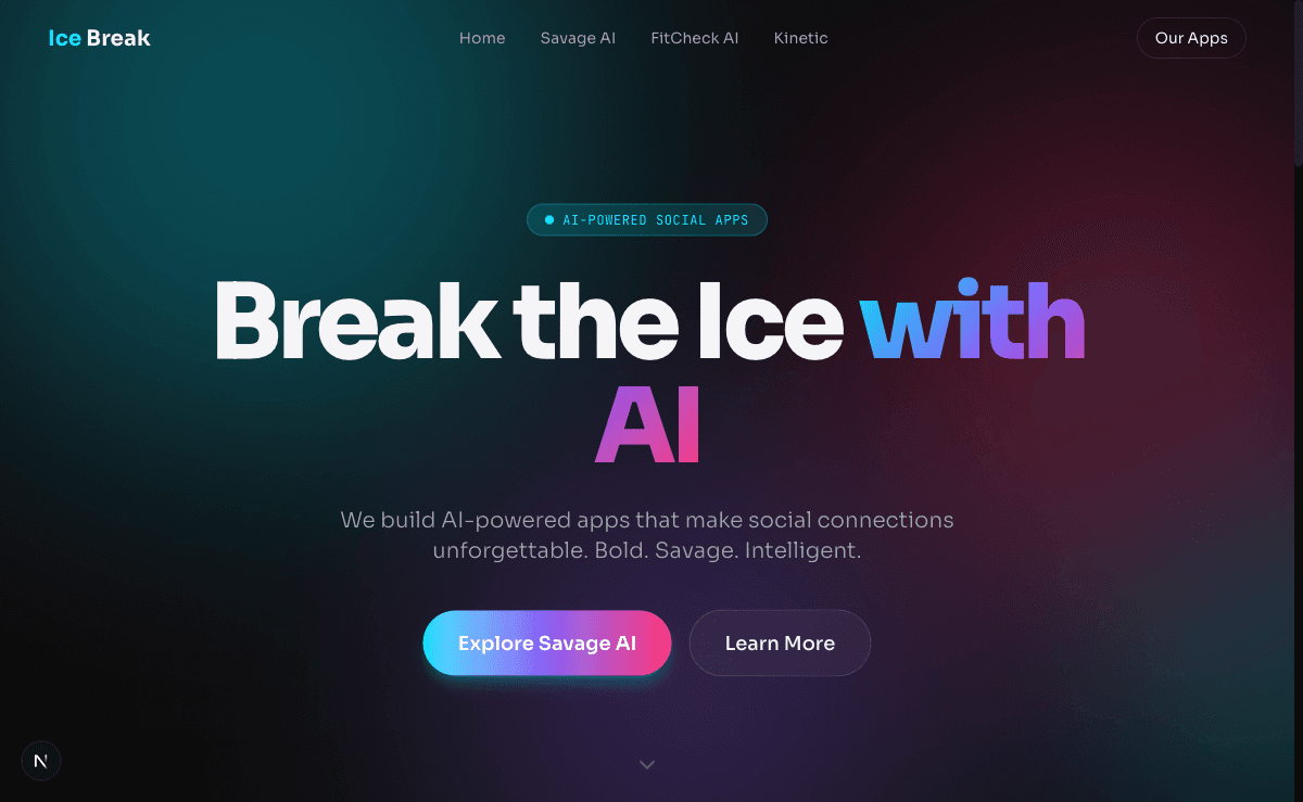
Immersive dark-theme hero with gradient typography and dual CTAs

App showcase with glassmorphism cards and live preview mockups

Feature cards with icon system and descriptive copy
Where IceBreak AI started.
IceBreak AI had developed a genuinely innovative suite of AI-powered social apps — tools that could break the ice in any social setting, generate conversation starters, and even match users based on personality compatibility. But their web presence told a completely different story. The existing site was a hastily assembled template with stock imagery, inconsistent branding, and a generic layout that failed to communicate the sophistication of the underlying technology. Visitors couldn't immediately understand what IceBreak AI did, let alone feel compelled to download the apps.
The numbers reflected the disconnect. The site's conversion rate from visitor to app download hovered around 1.1%, well below the industry benchmark of 3–4% for app landing pages. Bounce rates exceeded 72%, and average session duration was under 40 seconds — visitors were leaving before they even scrolled past the hero section. Mobile performance was particularly poor, with a PageSpeed score of 34 and layouts that broke on smaller screens, despite the fact that over 68% of their traffic came from mobile devices.
Beyond the technical shortcomings, IceBreak AI lacked a cohesive visual identity on the web. Their apps featured a sleek dark-mode aesthetic with vibrant gradients, but the website used a flat white background with mismatched colors. There was no visual continuity between the product experience and the marketing experience, which eroded trust and made the brand feel fragmented. The founding team knew they needed a complete overhaul — not just a redesign, but a reimagination of how their brand showed up online.
The strategy behind the numbers.
Immersive Dark-Theme Design System
We created a comprehensive design system rooted in IceBreak AI's product aesthetic — a rich dark theme with cyan-to-magenta gradient accents, glassmorphism cards, and layered depth effects. Every component was designed to feel like an extension of the app itself, creating seamless visual continuity from website to product. We developed over 40 reusable components in Figma before writing a single line of code.
Next.js Performance Architecture
We built the site on Next.js with static generation for marketing pages and edge-optimized API routes for dynamic content like app reviews and download counts. Images were served via next/image with automatic WebP conversion and lazy loading. We implemented route prefetching, code splitting at the component level, and aggressive caching strategies that pushed the PageSpeed score from 34 to 96 on mobile.
App Showcase & Interactive Demos
Rather than relying on static screenshots, we designed interactive app showcase sections where visitors could see the AI in action. Animated conversation flows, personality matching visualizations, and a live demo of the icebreaker generator gave visitors a taste of the product without downloading anything. These interactive elements were built with Framer Motion and optimized to run smoothly even on mid-range mobile devices.
Conversion-Optimized User Journeys
We mapped out three distinct user journeys — casual browsers, power users evaluating features, and press/investors seeking credibility signals — and designed the information architecture to serve all three. Strategic CTA placement, social proof modules showing real-time download counts, and a frictionless deep-link system that opened the correct app store based on device type all contributed to a dramatically streamlined path from interest to installation.
Want a strategy like this for your business?
We'll audit your current SEO, identify your biggest opportunities, and outline a roadmap to get there. No obligation, no sales pitch.
The numbers speak for themselves.
Organic clicks growth
Monthly performance over the engagement period
Designed and shipped a 14-page marketing site in under 10 weeks from kickoff to launch
Created a glassmorphism design system with 40+ reusable components and full dark-mode consistency
Built interactive AI demo sections that increased average scroll depth by 64%
Reduced Largest Contentful Paint from 6.2s to 1.1s on mobile devices
Implemented smart deep-linking that auto-detected device type and routed to the correct app store
Developed a real-time social proof ticker showing live download counts and user testimonials
While you're reading this, your competitors are ranking.
Every month without SEO is revenue left on the table.
Takes 2 minutes. No credit card required.
Month by month progression.
Discovery & Design System
Conducted stakeholder interviews, competitive audit, and user research. Built the complete design system in Figma including all dark-theme components, gradient tokens, and glassmorphism patterns.
Wireframes & High-Fidelity Designs
Created wireframes for all 14 pages, then moved into high-fidelity mockups. Presented three hero concepts and iterated on the chosen direction with interactive Figma prototypes for stakeholder review.
Next.js Development & Interactive Builds
Set up the Next.js architecture with static generation, built out all page templates, and developed the interactive AI demo components using Framer Motion and custom WebGL effects.
Performance Optimization & QA
Ran comprehensive performance audits across 12 device profiles. Optimized all images, implemented code splitting, configured edge caching, and resolved every accessibility issue to achieve WCAG 2.1 AA compliance.
Launch & Post-Launch Optimization
Deployed the site with zero downtime migration, set up analytics and conversion tracking, and ran two weeks of A/B tests on CTA placement and hero messaging that yielded an additional 18% lift in conversions.
“Above Blank didn't just build us a website — they translated our entire product vision into a web experience that actually feels like using our apps. The interactive demos alone have changed how we pitch to investors. Within the first month after launch, our web-driven app downloads nearly tripled, and for the first time, our online presence matches the quality of what we've built.”
More case studies
Ready for results
like these?
Every engagement starts with a free SEO audit. We'll identify your biggest growth opportunities and build a strategy to capture them.