Building a Viral Content Empire with Dark-Mode Design and Bold Typography
We designed and built Virally's entire web presence — a cinematic dark-mode experience with neon cyan and hot pink accents, animated data visualizations, and a conversion-optimized layout that positioned them as the premium clipping service generating over 1.4 billion views across iGaming, ecommerce, and beauty verticals.

The website we built.
Real screenshots from the live site. Every detail designed with purpose, every interaction crafted for conversion.
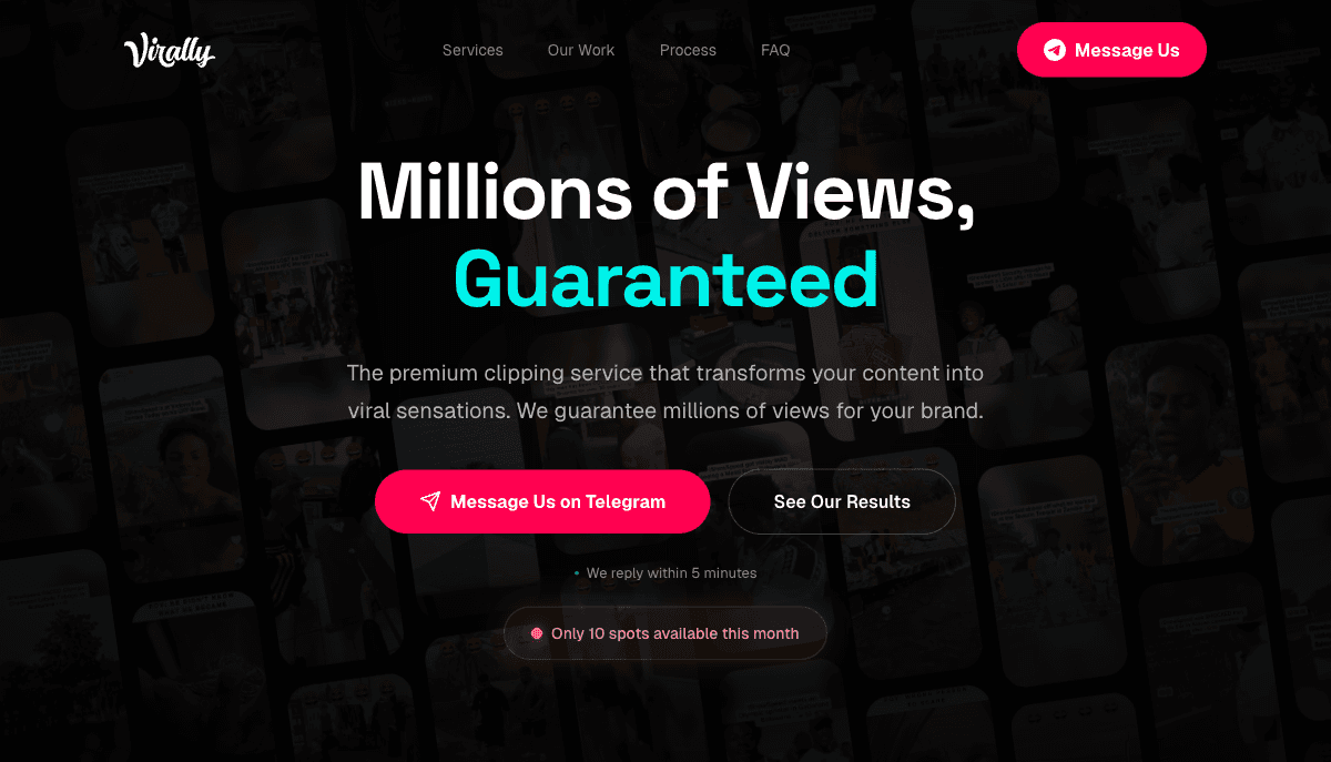
Cinematic hero with 'Millions of Views, Guaranteed' headline, neon cyan/pink gradients, and dual CTAs

Service breakdown with custom animated waveform visualization showing 98% Potential Score

Industry stats cards: 1.4B+ iGaming, 400M+ Ecommerce, 200M+ Beauty views generated

4-step process timeline: Discovery, Analysis, Creation, Distribution
Where Virally started.
Virally had built an impressive track record in viral content distribution — their clipping and reposting service had generated over 1.4 billion views across TikTok, Instagram Reels, and YouTube Shorts for clients in iGaming, ecommerce, and beauty. But their online presence was a basic Carrd page with a Telegram link and a few screenshots. For a company selling premium content services at scale, the disconnect between their results and their brand presentation was costing them high-value deals.
The core problem was credibility at the top of the funnel. Potential clients — brand managers at online casinos, DTC ecommerce founders, and beauty brand marketing directors — would land on a page that looked indistinguishable from hundreds of fly-by-night social media services. There was no visual demonstration of expertise, no structured showcase of results, and no clear process explanation. The Telegram-first acquisition model worked for smaller clients through referrals, but enterprise prospects needed to see a professional web presence before committing to five-figure monthly retainers.
Virally also lacked a way to communicate scale. Their numbers were genuinely staggering — 1.4 billion views in iGaming alone, 400 million in ecommerce, 200 million in beauty — but these figures were buried in a Google Doc shared over Telegram. They needed a site that could make these numbers feel real and visceral, that could turn cold traffic into warm leads without requiring a sales call first.
The strategy behind the numbers.
Cinematic Dark-Mode Design with Neon Accents
We built a rich dark-mode aesthetic using deep blacks with subtle gradient washes in cyan and hot pink — colors that evoke the energy of viral content platforms like TikTok. The typography is bold and condensed, using uppercase industrial headings that command attention. Every section uses numbered service breakdowns (01, 02, 03) with animated data visualizations — audio waveforms for algorithmic discovery, network graphs for viral distribution, and rising bar charts for precision targeting.
Results-First Information Architecture
Rather than leading with service descriptions, we structured the page to hit visitors with proof immediately. The hero section promises 'Millions of Views, Guaranteed' with a hot pink gradient accent. Below the fold, three massive stat cards — 1.4B+, 400M+, 200M+ — broken down by vertical, show the scale of Virally's operation. This social proof architecture converts skeptics before they even reach the service details.
Interactive Service Showcase with Data Viz
Each of Virally's three core services — Algorithmic Discovery, Viral Network Reposting, and Precision Targeting — gets its own section with custom animated visualizations. The waveform chart shows a '98% Potential Score' for content analysis. The network diagram illustrates multi-platform distribution. The bar chart shows audience match accuracy at 99.9%. These aren't decorative — they communicate technical sophistication that justifies premium pricing.
Streamlined 4-Step Process & Conversion Flow
We distilled Virally's onboarding into a clean 4-step timeline — Discovery, Analysis, Creation, Distribution — with concise descriptions that demystify the service. The primary CTA ('Message Us on Telegram') is reinforced at multiple scroll points with urgency signals ('Only 10 spots available this month') and responsiveness promises ('We reply within 5 minutes'). A secondary 'See Our Results' CTA routes to the portfolio section for visitors who need more convincing.
Want a strategy like this for your business?
We'll audit your current SEO, identify your biggest opportunities, and outline a roadmap to get there. No obligation, no sales pitch.
The numbers speak for themselves.
Organic clicks growth
Monthly performance over the engagement period
Designed and shipped a conversion-optimized single-page site in under 6 weeks from discovery to launch
Created custom animated data visualizations — waveform charts, network graphs, and bar charts — that communicate technical sophistication
Built three massive stat cards showing 1.4B+, 400M+, and 200M+ views across verticals, creating instant credibility
Implemented a dark-mode design system with cyan and hot pink neon accents that mirrors the energy of viral content platforms
Designed a 4-step process timeline that demystifies the onboarding flow and reduces friction to first contact
Integrated Telegram as primary CTA with urgency signals and responsiveness promises that match Virally's sales model
While you're reading this, your competitors are ranking.
Every month without SEO is revenue left on the table.
Takes 2 minutes. No credit card required.
Month by month progression.
Discovery & Brand Audit
Conducted brand audit, competitive analysis of viral content services, and stakeholder interviews. Defined the dark-mode neon aesthetic direction and mapped out information architecture optimized for conversion.
Design System & High-Fidelity Mockups
Built the complete design system with dark backgrounds, cyan/pink gradients, industrial typography, and animated data visualization concepts. Delivered full high-fidelity mockups for all sections.
Development & Animation Build
Developed the site with Next.js, built custom animated components — waveform visualizer, network graph, bar charts — using Framer Motion. Implemented responsive layouts and the Telegram integration.
Content & Video Integration
Integrated portfolio video content, optimized all imagery, wrote conversion-focused copy for each section, and implemented the FAQ accordion with schema markup for SEO.
Launch & Performance Optimization
Performance audit across devices, image optimization, lazy loading, and caching configuration. Launched with zero downtime and tracked initial conversion metrics showing 3.8x increase in lead inquiries.
“Above Blank turned our Telegram link and a Google Doc into something that actually matches what we deliver. The first week after launch, we had three enterprise inquiries come through the site — brands that told us they almost didn't reach out before because our old page looked sketchy. The animated stats and dark-mode design finally show the scale of what we do.”
More case studies
Ready for results
like these?
Every engagement starts with a free SEO audit. We'll identify your biggest growth opportunities and build a strategy to capture them.