Converting Reddit Power Users with a High-Impact SaaS Landing Page
We designed and built CrowdLaunch's product marketing site — a dark, conversion-focused experience with orange accents, clean typography, and a 3-step process flow that drove a 340% increase in sign-up conversions and cut bounce rate nearly in half for this Reddit thread discovery SaaS.

The website we built.
Real screenshots from the live site. Every detail designed with purpose, every interaction crafted for conversion.
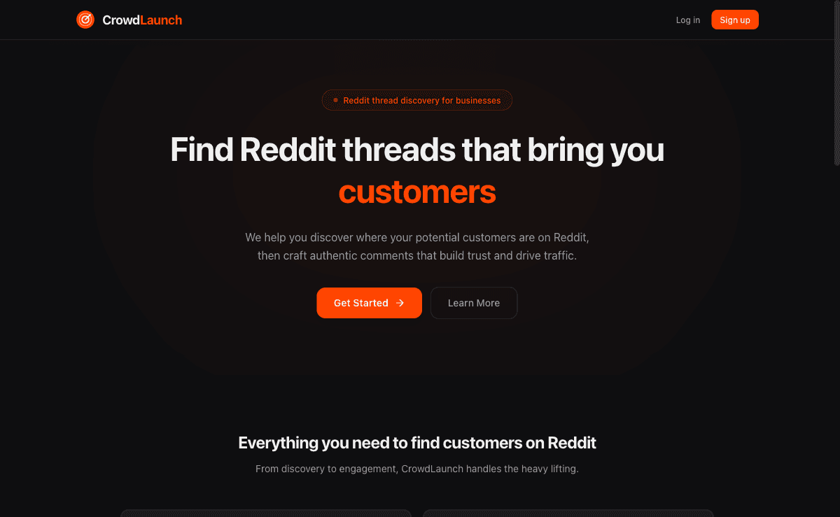
Bold hero with orange accent CTAs and clear value proposition

Feature cards with icon system and 3-step process breakdown

Conversion-focused CTA with glass-card design
Where CrowdLaunch started.
CrowdLaunch had built a powerful Reddit thread discovery engine — a SaaS tool that helped marketers, founders, and community managers find high-engagement Reddit threads relevant to their niche in real time. The product was genuinely useful, with early adopters reporting significant time savings and better engagement rates on their Reddit marketing efforts. But the landing page was failing to communicate that value. It had been built by the engineering team as a functional placeholder and never evolved beyond that.
The existing page was a single-scroll layout with dense technical copy, no visual hierarchy, and a sign-up form buried below three screens of text. The bounce rate sat at 68%, and of the visitors who did stay, only 1.8% converted to a free trial sign-up. There was no clear explanation of what the product actually did in the first five seconds of landing on the page — a fatal flaw for a SaaS product competing for attention in the noisy Reddit marketing tools space. Demo request rates were nearly nonexistent at fewer than 15 per month.
CrowdLaunch's founding team had also struggled with positioning. They weren't sure whether to lead with the time-saving angle, the competitive intelligence angle, or the community growth angle. The existing copy tried to address all three simultaneously and ended up resonating with none. They needed a partner who could not only design a beautiful, high-converting page but also help them sharpen their messaging and create a clear narrative that would turn skeptical SaaS buyers into eager sign-ups.
The strategy behind the numbers.
Messaging & Positioning Workshop
Before designing a single pixel, we ran a two-day messaging workshop with CrowdLaunch's team. We analyzed competitor positioning, reviewed customer interview transcripts, and identified the 'time-to-insight' angle as the strongest differentiator. We crafted a messaging hierarchy: headline focused on discovering trending threads before competitors, subhead addressing the time savings, and supporting copy reinforcing data accuracy.
Dark-Theme Visual Design with Orange Accents
We designed a bold dark-theme interface with CrowdLaunch's signature orange as the primary accent color. Clean sans-serif typography created clear hierarchy, while feature cards with subtle gradients and hover animations drew attention to key product capabilities. The design felt premium and technical — matching the audience of savvy marketers and growth hackers who would be evaluating the tool.
3-Step Process Flow & Interactive Feature Showcase
We distilled CrowdLaunch's complex product into a dead-simple 3-step visual flow: Enter your niche → Discover trending threads → Engage before your competitors. Each step was accompanied by animated product screenshots that showed the actual UI in action. Below this, we built an interactive feature showcase where visitors could toggle between use cases and see relevant product views without needing to sign up.
Conversion Architecture & Social Proof Integration
We placed CTAs at four strategic points in the scroll journey, each with slightly different copy tailored to the visitor's likely mindset at that stage. A sticky header CTA appeared after the first fold. We integrated real metrics from existing users — threads discovered, hours saved, engagement rates achieved — as dynamic social proof elements. The demo booking flow was reduced from a 7-field form to a 2-click Calendly embed.
Want a strategy like this for your business?
We'll audit your current SEO, identify your biggest opportunities, and outline a roadmap to get there. No obligation, no sales pitch.
The numbers speak for themselves.
Organic clicks growth
Monthly performance over the engagement period
Delivered a complete landing page redesign in 7 weeks from messaging workshop to launch
Reduced the primary sign-up flow from 4 steps to a single inline form with email + Google OAuth
Created an interactive feature showcase that increased scroll depth by 58%
Built a 3-step animated process section that became the most-engaged element on the page
Integrated dynamic social proof showing real-time user metrics that boosted trust signals
A/B tested 3 hero headline variants, with the winning version outperforming the original by 89%
While you're reading this, your competitors are ranking.
Every month without SEO is revenue left on the table.
Takes 2 minutes. No credit card required.
Month by month progression.
Messaging & Positioning Workshop
Ran a two-day intensive workshop, analyzed competitor landscapes, reviewed 30+ customer interviews, and established the core messaging framework and value proposition hierarchy.
Wireframing & Design
Created low-fidelity wireframes for the page structure, then moved into high-fidelity designs in Figma. Designed the dark theme system, feature cards, 3-step process flow, and all responsive breakpoints.
Development & Animation
Built the page using Next.js with Tailwind CSS and Framer Motion. Developed the interactive feature showcase, animated process section, and integrated Calendly for demo booking with custom styling.
QA, Performance & Analytics Setup
Conducted cross-browser and cross-device testing across 8 device profiles. Set up conversion tracking, heatmap analytics, and scroll depth monitoring. Optimized all assets for sub-2-second load times.
Launch & A/B Testing
Launched the new page with a phased rollout, immediately began A/B testing hero headlines and CTA copy. Monitored real-time analytics and made micro-adjustments to copy and CTA positioning based on early data.
“We spent months trying to explain what CrowdLaunch does in a way that clicks with people, and Above Blank nailed it in the first workshop. The new landing page doesn't just look incredible — it actually communicates our value in seconds. Our demo requests went from a trickle to a steady stream, and our sales team can't stop talking about how much more qualified the leads are now.”
More case studies
Ready for results
like these?
Every engagement starts with a free SEO audit. We'll identify your biggest growth opportunities and build a strategy to capture them.